OTC Price Bands
A daily picture of where money moved in the OTC market, sorted by what a share costs.
Why this exists
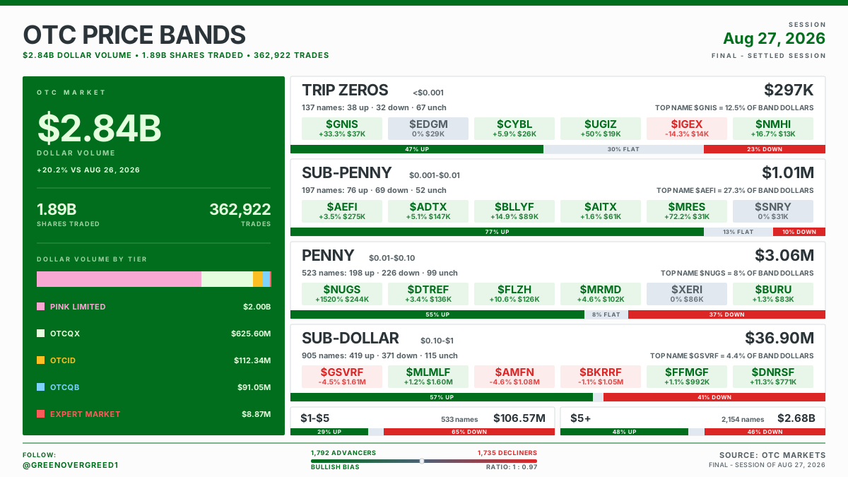
Every session the OTC tape prints a few billion dollars across roughly five thousand names. The problem is that the totals hide the story. Take the board above. It reports a $2.84 billion day, up 20.2% on the session before, which sounds like a big day anywhere. But $2.68 billion of that traded in names above $5, and everything priced under a dollar came to about $41 million, roughly one and a half percent of it. If you trade the sub-penny market, almost none of that headline was your market. The number and your screen are describing two different places.
OTC Price Bands splits the session into price bands and reports each one on its own terms: how much money it traded, how many names, which six tickers carried it, and which way the money went.
Why price bands instead of sectors or tiers
Price is the thing that decides how an OTC name behaves. A $0.0004 trip zero and a $12 OTCQX bank are on the same tape and have nothing else in common: different spreads, different float math, different reasons to move, different people trading them. Grouping by price puts every row next to the names it is genuinely comparable to.
| Band | Range |
|---|---|
| Trip Zeros | under $0.001 |
| Sub-Penny | $0.001 to $0.01 |
| Penny | $0.01 to $0.10 |
| Sub-Dollar | $0.10 to $1 |
| $1 to $5 | $1 to $5 |
| $5+ | above $5 |
The left panel: the whole day in one number
The large green figure is total dollar volume for the session, all of OTC, every tier. When there is a prior session to compare against, the percent change from it sits directly beneath, so you can tell a busy day from a quiet one without doing the arithmetic. It is omitted rather than dashed on any day the comparison cannot be made.
Below that sit two figures, shares traded and number of trades. Shares traded read against dollar volume tells you where the price weight sat. Huge share counts against modest dollars was a sub-penny day.
Then the tier bar: the same dollar total, split by OTC tier. OTCQX, OTCQB, OTCID, Pink Limited and Expert Market, each in its own colour. Expert Market is red because it is the one slice most retail accounts cannot touch. The tier slices always add back to the headline figure.
The right side: the ladder
Four full rows for the bands most people here trade, then one shared row carrying $1 to $5 and $5+. Every full row gives you:
- The band name and its price range
- Dollar volume for that band
- The names line, for example
1,318 names: 64 up, 73 down, 40 unch - Top name share, naming the band's single largest ticker and the percent of the band's dollars it accounted for
- Six leader cells, the band's top six by dollar volume, each showing its percent change and its dollars on a green, red or grey ground
- A colour bar along the bottom edge, which is the part most worth understanding
The bar measures dollars. The names line counts tickers. They disagree often.
This is the one thing to internalize.
Look at the penny row on the board above. Its names line reads 523 names: 198 up, 226 down, 99 unch. More things fell than rose, so by head count it was a red day for the band. Its bar reads 55% UP. More than half of every dollar that traded in penny names that session traded in a name that finished higher, because $NUGS alone did $244K on a 1,520% move and the other advancers carried the rest.
Both facts are true. They answer different questions.
- "Did more things go up or down" is the names line.
- "Where did the money actually go" is the bar.
In a market where two tickers routinely carry an entire band, the second question is usually the one worth asking. So the bar gets the colour, and it prints its own percentages on itself so you never have to decode a legend.
A red-leaning names line beside a bar reading 55% UP is not a contradiction. It is the story: a few names carried the band. The leader cells tell you which ones.
Top name share
On the board above the sub-penny row reads TOP NAME $AEFI = 27.3% OF BAND DOLLARS. That one ticker was 27.3% of everything that traded in the band. The penny row below it reads 8%, and those two rows describe very different sessions.
High numbers mean one name was the band. Low numbers mean the money was spread across it. It is the fastest way to separate "the sub-penny market was active" from "one sub-penny ticker was active", and those are very different days.
The footer: the whole market's breadth
Advancers against decliners for all of OTC, with a needle showing which side the day leaned and the ratio spelled out. On the board above it reads 1,792 advancers against 1,735 decliners, a bullish bias at 1 : 0.97, which is about as evenly split as the tape gets.
This is head count across the entire tape, not dollars, and not any one band. It is the one place on the image where the count measure gets the last word, because at market scale the concentration effect that makes count misleading inside a single band averages out.
What is deliberately not on it
- The Expert Market is not a band row. It is a disclosure tier, not a price range, and most retail accounts cannot trade it. Its dollars appear in the tier bar on the left and nowhere else on the image.
- No forecasts, targets or picks. The leader cells are simply the largest names by dollar volume that session. Largest is not best. A name can lead its band on the way down, and its cell is red when it did.
- No intraday. This is the settled close for the prior session.
This is a recap of what already happened. Nothing on it is a recommendation, and dollar volume tells you where attention went, not whether it deserved to.